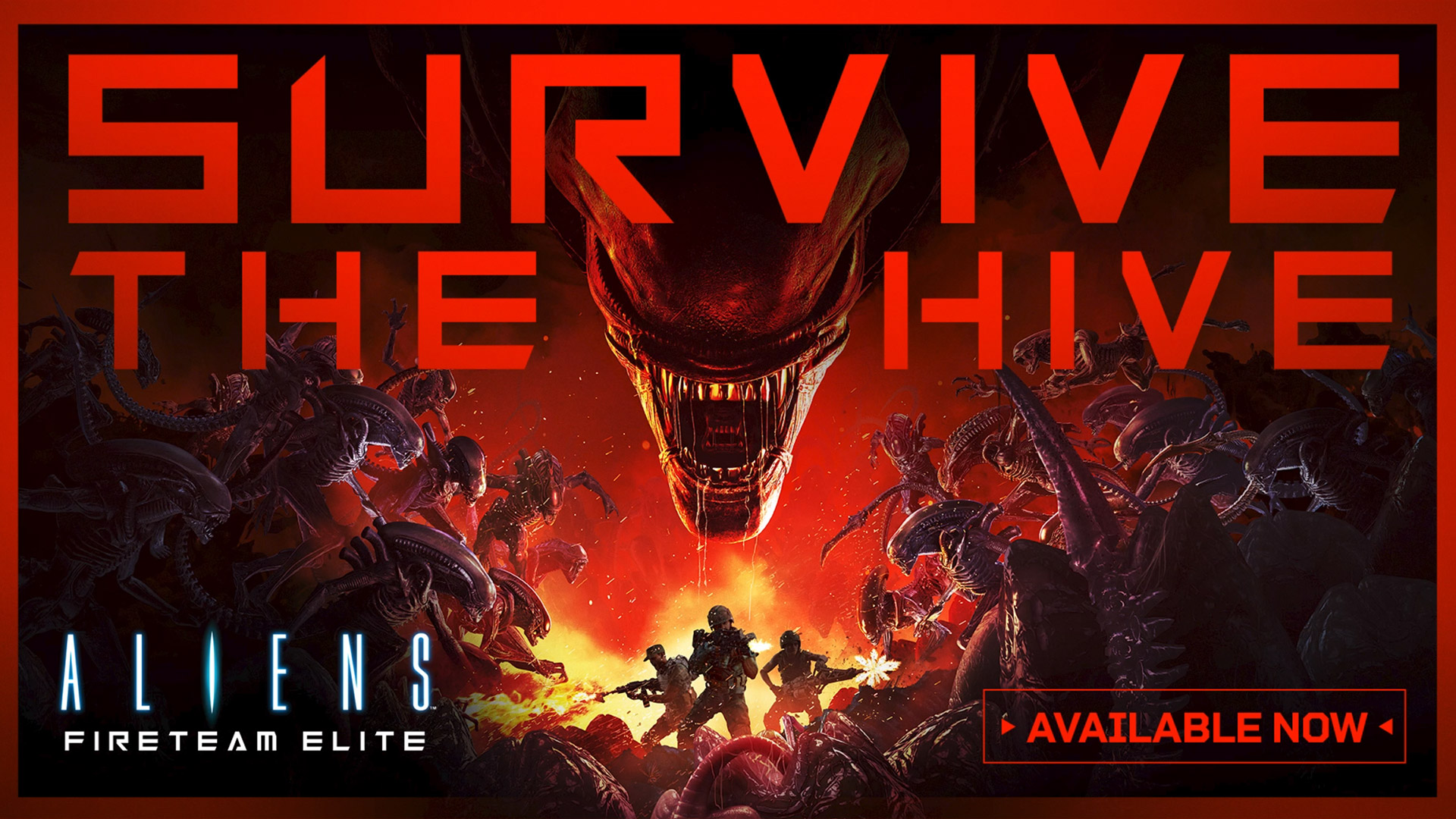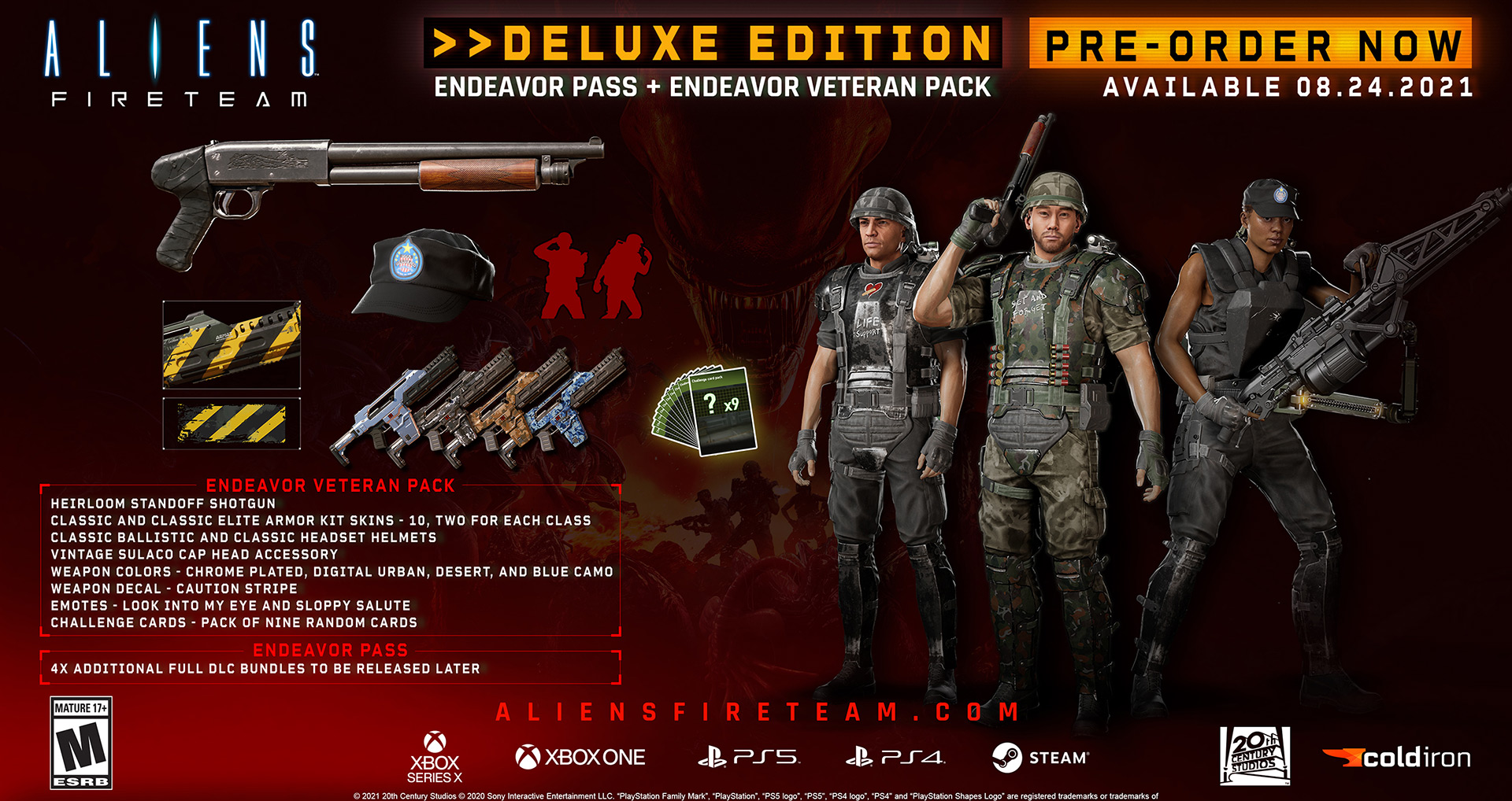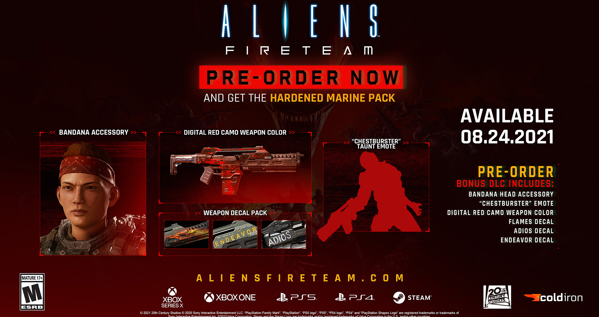
PETROL teamed up with Cold Iron Studios to help take their existing campaign in a newer, more bold direction. We strongly believed that a brand with such a beloved legacy needed to take risks and go bigger in order to appeal to a broader audience. In addition to emphasizing scale and scope, we made the decision to move away from decades of Green and Blue hues in favor of a Red, Orange and Purple palette unlike any other Alien game. The expected is where the brand was before PETROL’s involvement. Bold, Fiery and Aggressive is where we took it.
CLIENT
Cold Iron Studios
REQUIREMENTS
Brand Strategy, Logos, Key Visuals, Pre-order Trailer, Social Assets, 3D Development, Motion Graphics with Music
HATCHING MASS EXCITEMENT
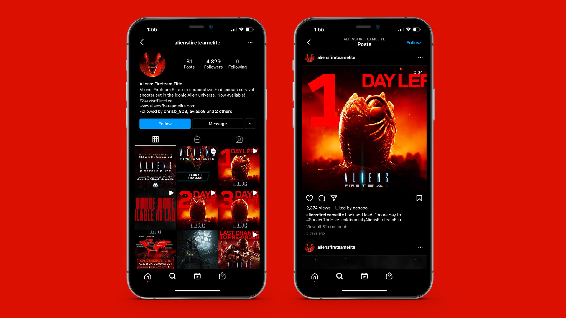
Our digital campaign delivered an adrenaline-inducing sense of danger to our target audiences in an up close and personal way. Mobile advertisements pushed the threat factor from familiar foes with our key art and brand line presented in bold reds and blacks. Social media countdowns leveraged a hatching alien egg to press the emotional buttons of viewers with big cinematic promise on the small screens.
Igniting An Audience
We took our AV and Key Visual approach and expanded into a Social Media Campaign that made the Xenomorphs anti-heroes in order to hammer home the stakes our players will find when they first boot up the game.
Living up to Blockbuster Hype
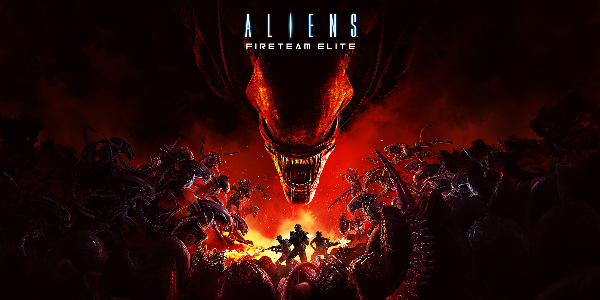
We took one of the truly iconic franchises in movie history and elevated it to the stasis we believe is appropriate of such a luminary series.
The Hue of the Fight
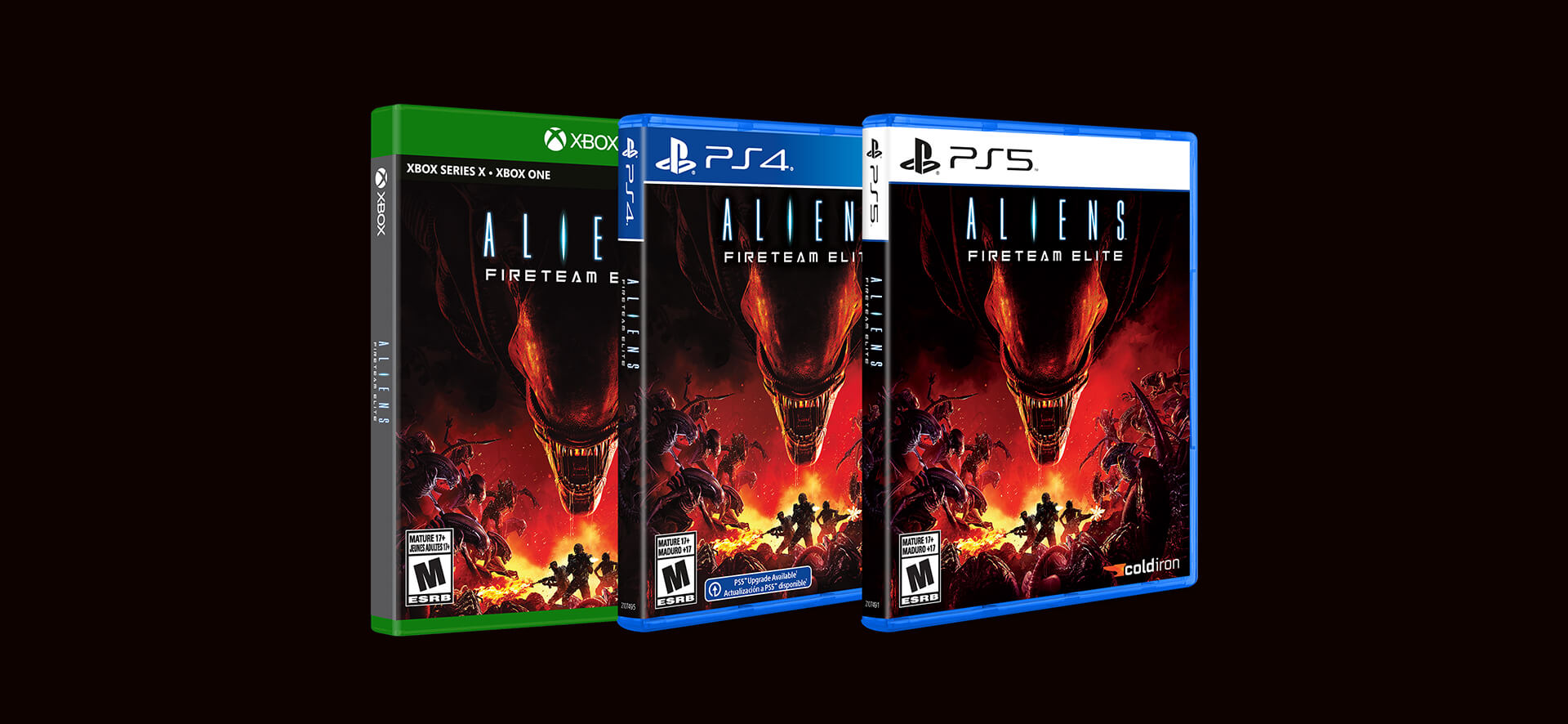
A key decision we fought for was to eschew the traditional blues and greens of the franchise in favor of a much warmer palette that embodies the aggressive battle between Marine and Alien.
Impossible Odds
To underline the viciousness of the Alien threat, we put our Marines in the middle of a swarm where death is everywhere one can see.
